ios-personmd-notifications md-help-circle

Profile

  • Guest
    medal 0
  • Posts: 21
  • Post Likes: 3765

Notifications

  • No Unread Notifications

Approved
New Race Viewer (PC)

warning
This thread is closed. Threads older than 6 weeks are closed automatically. To continue this discussion, create a new thread.
angle-double-left ios-arrow-back 1 ios-arrow-forward angle-double-right
md-lock This topic has been closed by the moderator
medal 5000
4 years 253 days ago (Last edited by Peter Man 4 years 253 days ago)
Just some feedback regarding the new race viewer, from the PC version.

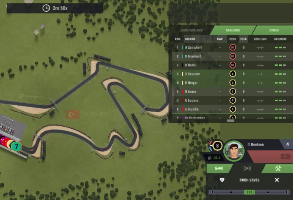
I personally find the race writings (letters and numbers) on the race leaderboard, quite hard to read.

This can be a little problematic during races, as reading the data gaps (exact time differences, and which driver is where) takes 3-4 times as longer than before.

2nd feedback is that the tyre chart should included the previous tyre laps done per stint, as an option, or as the default option. This new one is harder to read, as you are subtracting (ie. Lap 25-Lap42) rather than before, where the exact tyre lap stint was indicated.

And lastly, and maybe most importantly, the tyre temperature needle is not completely clear. It is very important for all managers to know where the tyre temperature guage is (otherwise we are racing effectively a little drunk, as it is not completely clear)

And I understand a lot of work has gone into this update, which is very commendable given these current times with the pandemic :)


Tyre Temperature needle is particularly affected, when it is at the central point, and under the central point
md-quotelink
medal 5000
4 years 253 days ago
I totally agree with Peter. The new typography is very difficult to read, especially when it comes to the leaderboard. Guess you could easily optimise that.
md-quotelink
medal 5000
4 years 253 days ago
same for me, its terrible trying to stare at the gaps for drs..
Please make a modification as i enjoy much more playing on pc but this has messed the viewer right up.


md-quotelink
medal 5000
4 years 253 days ago
You guys, complaining about fonts but you all look at the dots in stead of the cars ?? 
md-quotelink
medal 5070
4 years 253 days ago
about leaderboard , the scrolling doesnt work as good as  in previous viewer . Would be nice if we could open up the leaderboard as previous , not just top10 like now .
otherwhise : nice work guys !
md-quotelink
medal 5542 Community Manager
4 years 253 days ago
Hello managers,

I really appreciate this feedback, I just shared this with the dev in charge of the viewer update. I’ll keep all of you informed.

Also I appreciate a lot that you see how valuable the work developers do even with the difficult global situation. Thanks! ❤️
md-quotelink
medal 5037
4 years 253 days ago
I have another request or suggestion-if possible, move the running line up the center, since the entire event takes place in the center, then the yellow flags will be easier to notice
md-quotelink
medal 5000
4 years 253 days ago (Last edited by Leo Yeo 4 years 253 days ago)
You
You guys, complaining about fonts but you all look at the dots in stead of the cars ?? 

It may look silly but comes with many small competitive advantages and, if you are one of the best managers, a small advantage is still one you will take.

Getting back on topic: Idm the new raceviewer, but I believe that may also be because I always full screen (F11) the raceviewer 
md-quotelink
medal 5000
4 years 252 days ago
Yep as the others have said above the new updates are so hard to read. I had my magnifier out just to see them!!! 

Having only the top 8 cars viewable on it was not fun at all. When you have leagues where there are 20 or more cars that are all in one big line the new scrolling up and down constantly takes us away from the racing. I know we are lucky to have competitive leagues but this has made it so difficult. 

Maybe the lap times eg if you are doing your fastest ones should be yellow or some other colour as the green blends into the fast sectores indicators! 

Was interesting having this hit all at once lol
md-quotelink
medal 5000
4 years 252 days ago

Leo
You
You guys, complaining about fonts but you all look at the dots in stead of the cars ?? 

It may look silly but comes with many small competitive advantages and, if you are one of the best managers, a small advantage is still one you will take.

Getting back on topic: Idm the new raceviewer, but I believe that may also be because I always full screen (F11) the raceviewer 


How could be that an advantage?? Explain me pls
md-quotelink
medal 5000
4 years 252 days ago (Last edited by Tony Maloney 4 years 252 days ago)
+1 for hard to read

either the programmer has bad vision or the game is now sponsored by spec savers... duping players to question their eye sight and get unnecessary tests ??
md-quotelink
medal 5169
4 years 252 days ago (Last edited by Leo Yeo 4 years 252 days ago)
Raul

Leo
It [dots/circles] may look silly but comes with many small competitive advantages and, if you are one of the best managers, a small advantage is still one you will take.

How could be that an advantage?? Explain me pls

The icon (circle) view allows you to fully zoom out while still being able to very easily see what teams and cars are around you. Zooming out allows you to see more of the track in one go, and if you've got good peripheral vision this can help with monitoring and controlling both of your cars at the same time even if one of them has taken an extra pitstop and is half way across the circuit. I find with icons it's also a lot easier to tell if you are going to get DRS (if your icon is just touching the one in front, you'll get DRS. Works on pretty much every track but Turkey where you have to get quite close). Icons also allow you to view cars by their team number, which is helpful if multiple teams have the exact similar cars and similar team colour (it'll force you to have to remember each team's number every season, but my memory is good so it hasn't been a problem for me).

The only real advantage I can see for cars over dots is that it looks more aesthetically pleasing.

Back on topic, after some further tests I can see where the complaints are coming from:
without F11, text is basically unreadable

not only is text too small, it seems that there is some weird highlight effect behind the characters, idk if that was done on purpose though

with F11, text is far more readable, which is why I thought it was fine. Still there's a lot of real estate available to make the text larger without losing any of the new detail added.
md-quotelink
medal 5542 Community Manager
4 years 252 days ago
Hello,

We’re working in a solution to the blurry and difficult to read text. I keep sharing all this feedback with our developer team. Please report all the bugs and suggestions you have. Thank you!
md-quotelink
medal 5000
4 years 252 days ago
its the text background colour, its too similar to the text colour.

dark background needed if text is light
md-quotelink
medal 5000
4 years 252 days ago (Last edited by Anakin Skywalker 4 years 252 days ago)
I have another suggestion, as your not the one driving the car, it's not really necessary to know what gear they are in and their acc and braking inputs maybe there could be a toggle that would instead show the tire wear and fuel remaining. Also I think that there only needs to be one indicator that DRS has been activated as two seems a bit too much. Furthermore, I really liked that you could be see the drivers position whereas is now it's been replaced with the drivers face, it would be nice to have the option to show either the current position or the face. Moreover the KERS boxes should be the same shape because when you press it the one on top of the car is a rectangle but the one on the HUD has a bit that sticks out therefore it can be a bit confusing as to how much you, and others have left.
md-quotelink
medal 5000
4 years 252 days ago

Leo
Raul

Leo
It [dots/circles] may look silly but comes with many small competitive advantages and, if you are one of the best managers, a small advantage is still one you will take.

How could be that an advantage?? Explain me pls

The icon (circle) view allows you to fully zoom out while still being able to very easily see what teams and cars are around you. Zooming out allows you to see more of the track in one go, and if you've got good peripheral vision this can help with monitoring and controlling both of your cars at the same time even if one of them has taken an extra pitstop and is half way across the circuit. I find with icons it's also a lot easier to tell if you are going to get DRS (if your icon is just touching the one in front, you'll get DRS. Works on pretty much every track but Turkey where you have to get quite close). Icons also allow you to view cars by their team number, which is helpful if multiple teams have the exact similar cars and similar team colour (it'll force you to have to remember each team's number every season, but my memory is good so it hasn't been a problem for me).

The only real advantage I can see for cars over dots is that it looks more aesthetically pleasing.

Back on topic, after some further tests I can see where the complaints are coming from:
without F11, text is basically unreadable

not only is text too small, it seems that there is some weird highlight effect behind the characters, idk if that was done on purpose though

with F11, text is far more readable, which is why I thought it was fine. Still there's a lot of real estate available to make the text larger without losing any of the new detail added.


Thanks!!! I get used to the cars cause aesthetic, but i dont know that dots help to tell you if you are in drs gap. In my league we play with only one car, so the zoom it s not a problem. Maybe i try to use the dots. Thanks again!!


Regarding the new interfaz, I found the old one better. It was easier to read the information, especially the one related with tyres, now is more confusing knowing how many laps have the present tyres. Also, with the old one you can see a total range of 16 positions; with the new one you can only see a range of 8.

(I m spanish, sorry if I ve made some mistakes)
md-quotelink
medal 5022
4 years 248 days ago
The new speedgauge takes too much place on the screen , sometimes i dont see my own car ( i race out zoomed )
plz bring back the old gauge or change this one . very annoying to race with . peace.
md-quotelink
medal 5000
4 years 245 days ago

Gianfranco
The new speedgauge takes too much place on the screen , sometimes i dont see my own car ( i race out zoomed )
plz bring back the old gauge or change this one . very annoying to race with . peace.


You can get rid of the speedgauge by clicking the "esc" button on your keyboard, then you will enjoy a clear view of the track :)
md-quotelink
medal 5022
4 years 243 days ago

Alessandro

Gianfranco
The new speedgauge takes too much place on the screen , sometimes i dont see my own car ( i race out zoomed )
plz bring back the old gauge or change this one . very annoying to race with . peace.


You can get rid of the speedgauge by clicking the "esc" button on your keyboard, then you will enjoy a clear view of the track :)


without speedgauge you cant follow your car properly imo , not a solution .
md-quotelink
medal 5542 Community Manager
4 years 229 days ago
Hello managers,

A new WebGL (Desktop) versión was released this afternoon (around 17:00 GMT). Please try the new version and let us know if it fixed this issue.
md-quotelink
md-lock This topic has been closed by the moderator
angle-double-left ios-arrow-back 1 ios-arrow-forward angle-double-right

You must be logged in to post a reply.