ios-personmd-notifications md-help-circle

Profile

  • Guest
    medal 0
  • Posts: 21
  • Post Likes: 3765

Notifications

  • No Unread Notifications

Approved
Leaderboard inside Push Levels' screen (Phones)

warning
This thread is closed. Threads older than 6 weeks are closed automatically. To continue this discussion, create a new thread.
angle-double-left ios-arrow-back 1 ios-arrow-forward angle-double-right
medal 5000
2 years 254 days ago
Since 1-5 and 6-0 were added to desktop's shortcuts, it evened out things between Browser/Desktop app and Tablet players with Push Levels, letting Phone ones in a slightly worse situation between using Pushs and the Leaderboard. It's particularly worse in poor quality connections, average phones and/or high pings, and it's quite important to get a good reference while out of the Leaderboard screen too.

That said, I would like to see a mini-leaderboard below the Push Levels to make things more even between all platforms, specially in fast paced races (2.0x), as corners come one after the other, and changing screens makes a big impact on the phone's performance and also on the players capabilities, as we have to be always changing screens rather than seeing everything in one go like other platforms do, which costs up to 3-4 extra steps in 2 car leagues and a few ms at each change + slightly mismatched Leaderboard and Push Level screens when the leaderboard is set to 5 cars view.

A draft of what would be useful, yet still simple enough to not make a huge impact on performance:


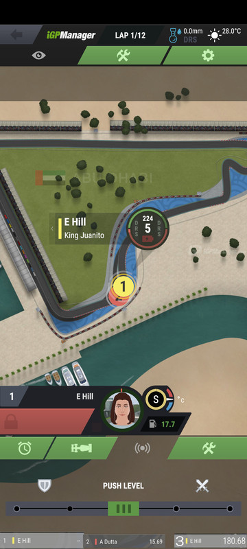
It would also be interesting to see sector bars/circles marking where the cars are/were compared to our own.
Another improvement would be the ability to see up to 5 cars like we do on the leaderboard (maybe for 3s at a time), but it's not as important as the change as a whole 👍 
md-quotelink
medal 5057
2 years 253 days ago
That would be cool if they can somehow find a way to work with the tiny screen real estate phones have. Big yes 👍.
md-quotelink
medal 5008 Community Manager
2 years 253 days ago
Hello,

Great suggestion, we’re looking at it.
md-quotelink
medal 5006
2 years 253 days ago
Juanito very Good Suggestion, another idea could be a window in a upper corner, maybe scrollable. So you can see also the gap to the leader, or if you are the leader in would be easier to see the gap for pitting, so you are able to see where you will come out 

225x500
md-quotelink
medal 5000
2 years 253 days ago

José
Hello,

Great suggestion, we’re looking at it.


Thanks José! Hopefully we can see it added this year still 😄


JNS
Juanito very Good Suggestion, another idea could be a window in a upper corner, maybe scrollable. So you can see also the gap to the leader, or if you are the leader in would be easier to see the gap for pitting, so you are able to see where you will come out 

225x500


I like your idea, but having a leaderboard inside the viewer like that would be problematic for small screens. Even mine (6,2") didn't fit a big one on your drawing and it would've blocked the in-race notifications and the space used to show the "Downloading the high resolution track" message. Imagine it in a phone with only 4-5" and it would've been incredibly hard to either read it or see the track 😅


The idea to make it scrollable is interesting, though. Maybe a copy of the old F1 / current NASCAR style of sideways scrolling using the lower mini-leaderboard I poorly edited can be more functional, while still simple enough. The shield (🛡️) and swords (⚔️) could even be slightly scaled down so the font on the mini-leaderboard could be a bit bigger and easier to read in one go 👍
md-quotelink
medal 5057
2 years 253 days ago


You know I was thinking about that earlier, I agree and my screen is 6'9.

What about if the race viewer opens in landscape mode? That might provide more screen real estate.
md-quotelink
medal 5006
2 years 253 days ago (Last edited by JNS Uchiha 2 years 253 days ago)
Or what about the Right space next to the tyre temp…..

Or making the area where the driver name is and the boost a bit smaller, so there might be enough space on the right side to add something like a leaderboard.

260x550
md-quotelink
medal 5000
2 years 253 days ago

O


You know I was thinking about that earlier, I agree and my screen is 6'9.

What about if the race viewer opens in landscape mode? That might provide more screen real estate.


Oops, typo there: Mine is 6.82" 😅

And please no. Landscape mode in phone looks awful and unplayable (at least for now) 😅


JNS
Or what about the Right space next to the tyre temp…..

Or making the area where the driver name is and the boost a bit smaller, so there might be enough space on the right side to add something like a leaderboard.

260x550


That's where the "Swap" (🔄) button is for 2 car leagues 😅
md-quotelink
medal 5006
2 years 253 days ago

Juanito

O


You know I was thinking about that earlier, I agree and my screen is 6'9.

What about if the race viewer opens in landscape mode? That might provide more screen real estate.


Oops, typo there: Mine is 6.82" 😅

And please no. Landscape mode in phone looks awful and unplayable (at least for now) 😅


JNS
Or what about the Right space next to the tyre temp…..

Or making the area where the driver name is and the boost a bit smaller, so there might be enough space on the right side to add something like a leaderboard.

260x550


That's where the "Swap" (🔄) button is for 2 car leagues 😅


😂😂😂😂 upps 

md-quotelink
medal 4901
2 years 243 days ago
I also find myself switching often between leaderboard and push level, I like this proposal.
md-quotelink
medal 5044
2 years 238 days ago
Best suggestion, ever.

The gap to the car ahead and the car behind should be visible at all times. It's one of the struggles when racing from a mobile device and why most people prefer PC over that.

For some reason, I thought that this was considered already. It's something that I expected to be noticed before. :)
md-quotelink
angle-double-left ios-arrow-back 1 ios-arrow-forward angle-double-right

You must be logged in to post a reply.